Mannok –
A rebrand built for growth with strong roots
BRANDING // DESIGN
Building on a legacy – and starting a new one
We helped the company formerly known as QIH to rebrand, with a new name and a new visual identity that matches the company’s ambition to expand in international markets, while recognising its deep commitment to its community.
With a legacy name that was implemented inconsistently across their diverse product ranges, and that no longer provided the unique brand recognition that was required as they sought to expand, QIH felt it was time for a complete overhaul of their brand.
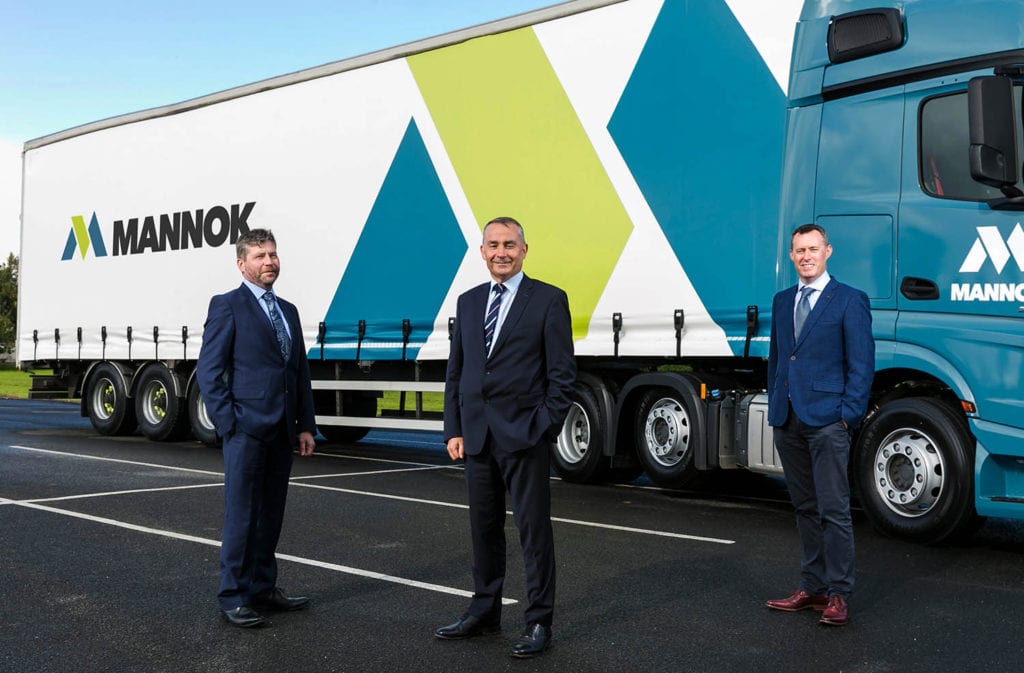
Working in collaboration with the senior management team, we developed a clear brief, and a timeline in which to deliver a new brand to be proud of.
A name with a sense of place and community
After extensive exploration, we hit on the name “Mannok” . Like the company itself, the name is deeply rooted in the region of Cavan and Fermanagh. The word comes from Fear Manach – meaning ‘people of Manach’, and it reflects the company’s enormous pride in their origins and its commitment to its people.
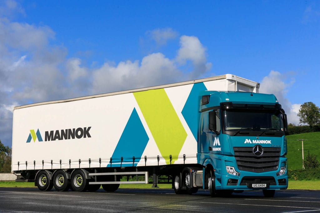
Visually, the logo combines strength with a deceptive simplicity. Dynamic shapes combine to form a unique ‘M’. The hint of 3 dimensional angles ties the logo to both their building and packaging products, and brings various elements together.
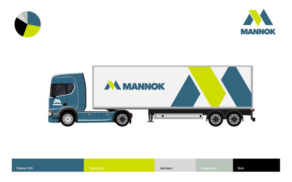
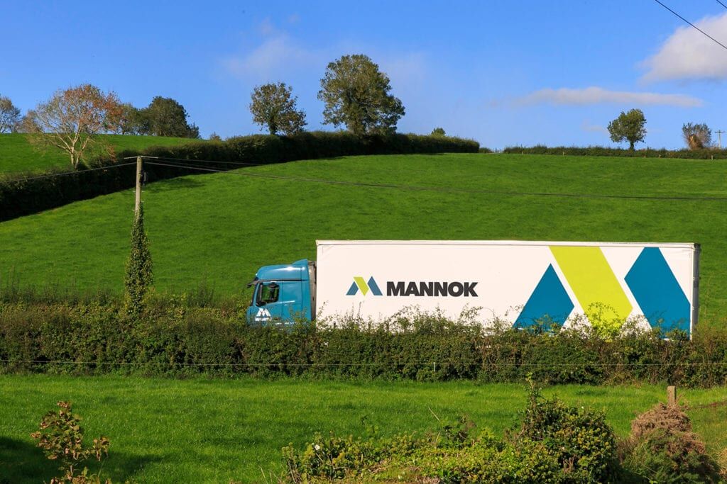
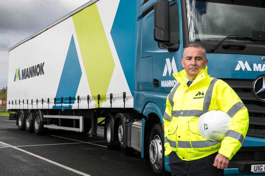
The big roll out. (Literally.)
We worked with Mannok’s marketing department on the roll out of the identity, from livery on the fleet to jackets and hard hats, while their in-house design team updated the product packaging.
And of course we developed a comprehensive set of brand guidelines to ensure that the awesomeness never gets diluted, and that the tone of voice across all channels rings true.