In this week’s Our Take, an Argentinian football club makes a swell point, Pinterest are refreshing the default, Roblox (shockingly) has shocked us, and we look at some v nice design work from ESPN.
A swell way to make a point
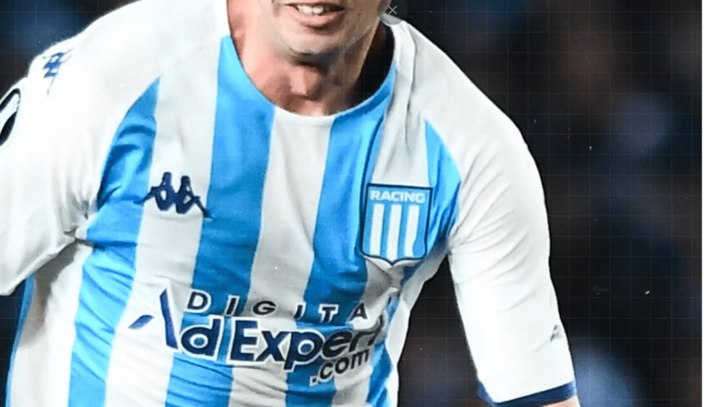
Racing Club, a football team in Argentina’s Primera Division, made headlines for all the right reasons recently.
Each week for four weeks, the team took to the field with a subtly altered club crest on their shirts. Week one, a small bulge appeared on one of the logo’s vertical blue stripes. By week four, this had swollen to a much larger size, distorting the shape of the badge itself. This predictably resulted in more and more fans moaning about the club tampering with the legendary crest. Racing then revealed the reason for the temporary change: the swelling mirrored the size and growth rate of a testicular tumour – four weeks is all the time it takes for the cancer to develop to this size – and the complaints stopped, the plaudits began.
Kudos to Racing, and their partners, Fuca, a cancer foundation, and shirtmaker Kappa Argentina. Any campaign that raises awareness of an important issue is deserving of plaudits but this well-thought-out campaign achieved that in spades.
Default diversity at last

For a long time, the complaint about search algorithms was that their results reflected the biases of the coders who wrote them. When more and more steps to increase diversity didn’t move the bar all that much, it turned out the search algorithms were now reflecting society’s biases back at us. And that bias was white and thin – particularly in image search, and particularly in fashion.
Which may explain why it’s Pinterest that is taking the lead in fixing this.
Pinterest has introduced new machine learning that can analyse body type and skin tone across billions of images on their platform. The result? Your search results will be more diverse, and also better tailored for each user. Pinterest believes that this push in representation will bring forward a new wave of inspiration for users when they can see similarities between themselves and their pins.
Greater representation in search results has been a long time coming, and this move by Pinterest gives us hope that in the future, diversity will be the default.
Will this make you more likely to pin?
Love and Roblox? Really?
It’s rare for an announcement to really shock us, but the news that Roblox – the kid-friendly online gaming platform – is planning to integrate a dating app, was a double shock.
The first shock was – what kind of sicko puts dating into a kids’ app?! The second shock was realising that many of the kids on Roblox are now adults, and we’re just old now.
A 17+ version of Roblox was recently introduced to allow for more mature features, such as video chat, and the dating app will be restricted to this age group. Roblox hopes that better in-game connections can translate to ‘real-life relationships’.
This seems like a risky move for a platform that has been so child-centred for so long, and that has struggled to maintain its reputation as a generally safe place for kids. No content moderation is perfect, and no screening process catches every bad actor. And 17 still seems very young.
Is a Roblox wedding invite going to be in our letterbox soon? Because we’re not sure we’re ready for that.
ESPN aces it
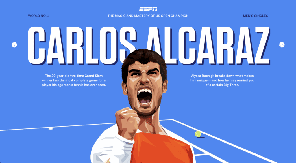
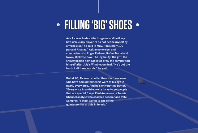
Regardless of your level of interest in sport (it varies hugely here in Sweartaker) you will love the work coming out of ESPN’s Creative Studio. Their latest feature – on rising tennis star Carlos Alcaraz – knocks it out of the park. Or aces it. Either way, it’s a masterpiece of visual storytelling, weaving together bright illustration, big stats, a longer-than-life scroll, and gorgeous transitions.
Alcaraz’s rise in the world of tennis has produced impressive statistics, and the designers really take advantage. Large, attention-grabbing stats appear throughout the webpage, showing the scale of Alcaraz’s achievements and adding an element of interactivity as readers see the numbers change as the story unfolds. It’s a brilliant way to immerse the audience in the story’s data, encouraging readers to keep scrolling.
And the scrolling feels endless at times. It’s a design choice that serves both form and function, reflecting Alcaraz’s seemingly boundless potential, and allowing the narrative to flow smoothly and keep readers engaged.
Calling it a webpage doesn’t do it justice; it’s a Scrollumentary, and we’d like to see more, please.
Feast your eyes – and your hunger for sports knowledge – here.