In this week’s Our Take, an ass-pirational design team with a cheeky new saddle, a Mumbai Mum is morto for her daughter’s coffee spending habits, we fill our cups with some McDonald’s nostalgia, and a drinks lab logo that grows on you.
a cheeky concept in comfort

For almost 200 years, bike seats have stuck to the same old design, because if it isn’t broken, why fix it? Well, ask your booty after a long ride.
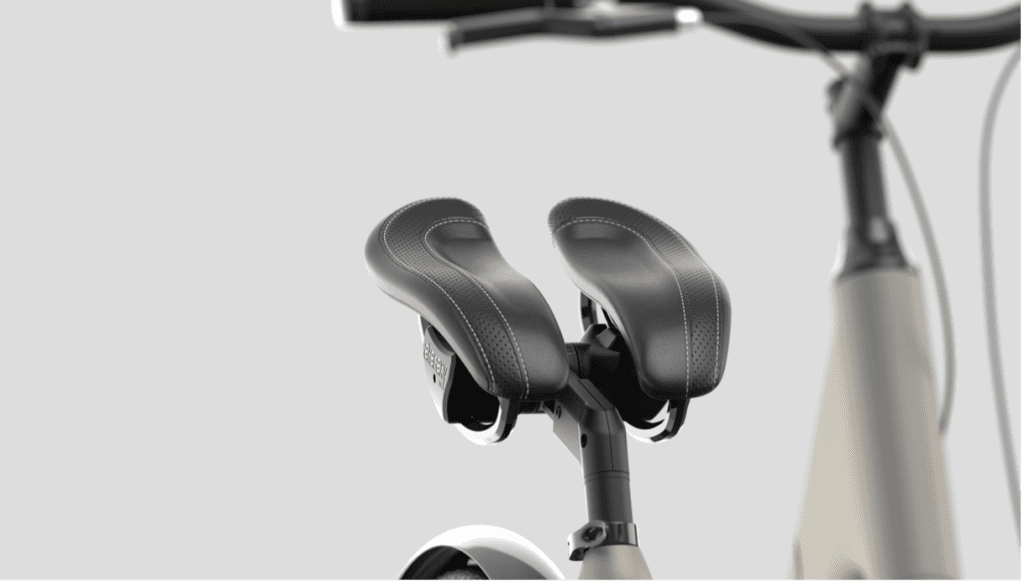
It took long enough, but Whistle Design Group, an industrial design company in Australia, has ‘cracked’ the code on saddle comfort with a genuinely innovative design that splits the saddle into two moving parts to save your butt, one cheek at a time.
The concept “allows for individual movement of the legs rotating around the hip joints, on an axis that is virtual to the seat.” Translation? This seat moves with you, supporting your butt cheeks individually while you pedal.
It’s called the ‘vabsRider, which stands for Virtual Axis Bicycle Seat. It’s a terrible name for a very promising invention that doesn’t look like much at first glance, but which might just solve a problem that’s been giving cyclists a pain in the butt for two centuries.
Keep mum on coffee costs

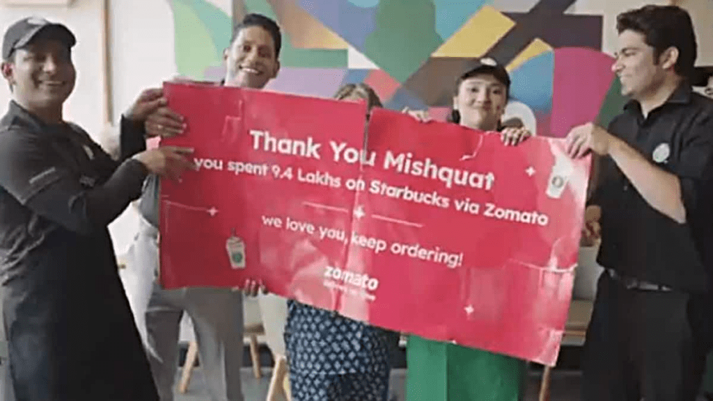
We all love our coffee, but a new spot by Starbucks and food delivery app Zomato, showcases how one customer in India took her love for coffee to a whole new level.
The set-up is that the brand sent a big thank you card to Mishquat, their most loyal customer, rewarding her for spending nearly 10,000 euros on deliveries of cinnamon coffee! Cue Mishquat’s mum storming into Starbucks complaining about the waste of money. Of course, she’s soon won over by the charming staff and the delicious cinnamon coffee.
While elements of the ad aren’t quite believable, Mishquat is a real customer, and there’s an underlying honesty in how the brand acknowledges the mother’s reaction to the money spent. The charming spot has received a lot of love from customers in India and is a great example of how Zomato uses data and consumer insights to churn out campaigns that relate with its audience.
Fill up on nostalgia

Image: McDonalds
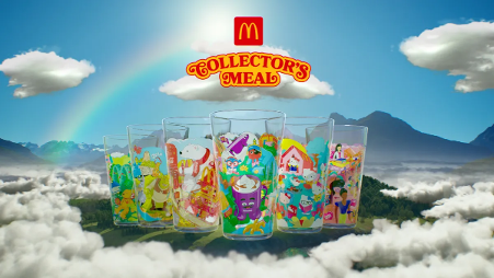
The kid’s meal toys may have gotten fancier, and more toy-like, and certainly more branded, but for many of us over 30, it’s hard to replace that rush of scoring a branded cup with your kid’s meal. (Was the past really that dull?)
McDonald’s are cashing in on this nostalgia with 6 collectible cups inspired by past collectible items. Referencing fan favourites Cowpoke McNugget Buddy, from 1988, and 2000’s Hello Kitty Crew, there is something for all. And it’s not even for kids, coming with a selection of McDonald’s breakfast and non-breakfast meals.
We want them all.
branding culture shock

Image: Manelena Studio
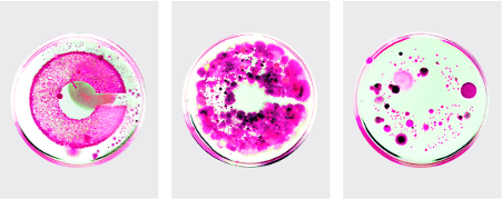
In the world of branding, where logos are typically polished, pixel-perfect, and digitally dazzling, one company has decided to get down and dirty – literally.
Crucible, a London-based drinks lab, has launched a new brand identity that is less designed and more cultured – in every sense of the word. The logo is a living testament to science and creativity – having been literally grown in a petri dish.
Designed by Madalena Studio, this is branding that’s indeed brewing up something special. Who knew that the future of logo design would be more about agar plates than Adobe palettes?
It took a while, but this one really did grow on us – because when it comes to standing out in today’s market, nothing beats a bit of natural selection.