
In this week’s Our Take: Duolingo teaches New York Fashion Week how to say it right, #FixedItIreland rewrites the headline (and the blame), Novig misses the point on women in sport, and Omega Yeast turns fermentation science into a brand identity.
THE WORDS WE USE MATTER

Research has shown that 70% of readers don’t read past a headline of an article, so #FixedItIreland’s work is doing more than just headlines, it is challenging the focus of stories and what people take away from them.
The initiative highlights how seemingly small choices in wording can shape the way a story is understood. Headlines that focus on a victim’s actions, circumstances or relationship with an attacker can unintentionally shift attention away from the person responsible for the crime.
#FixedItIreland rewrites these headlines to show how the same story can be framed differently, putting responsibility where it belongs and avoiding language that can contribute to victim-blaming or minimise sexual violence.
It raises an important question: are headlines simply summarising a story, or are they influencing how we understand it?
Reporting on sexual violence comes with a responsibility to be accurate, sensitive and clear. The campaign is a reminder that words matter, particularly when reporting on experiences that can already carry stigma and shame.
Sometimes, fixing a headline means more than changing a few words. It means changing the focus of the story.
SAY IT WITH ME NOW
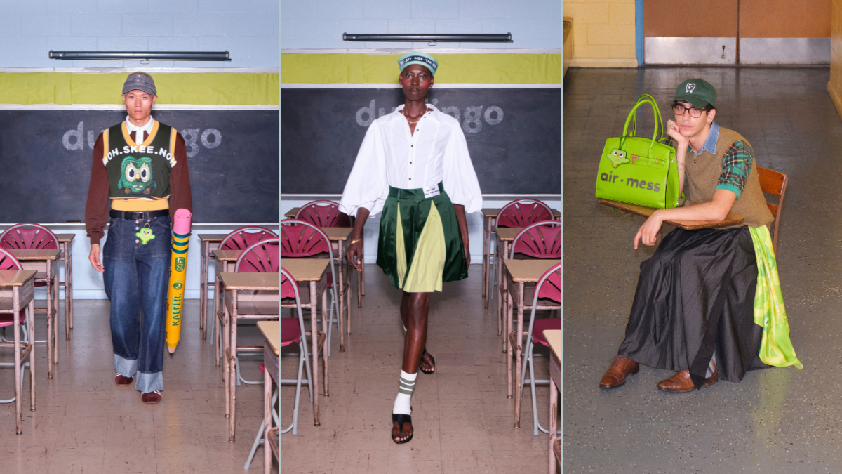
Duolingo launched ‘The Phonetic Collection’ at New York Fashion week: a seven piece collection created in collaboration with designer Megan O’Cain. The focus of the collection was simple but effective and build on human behaviour – taking difficult to pronounce brand names (you know the type you might shy away from saying out loud, in fear of getting it wrong) and spelling them phonetically on clothes and accessories. The campaign launched with a fun video on socials, that combined the humorous social presence Duolingo has become famous for with the visual language of fashion.
The result was a piece of branded content that felt unexpected, culturally relevant and surprisingly at home at NYFW.
SYDNEY WHAT ARE WE THINKING?
Have you seen the Sydney Sweeney advert? It’s got us talking!
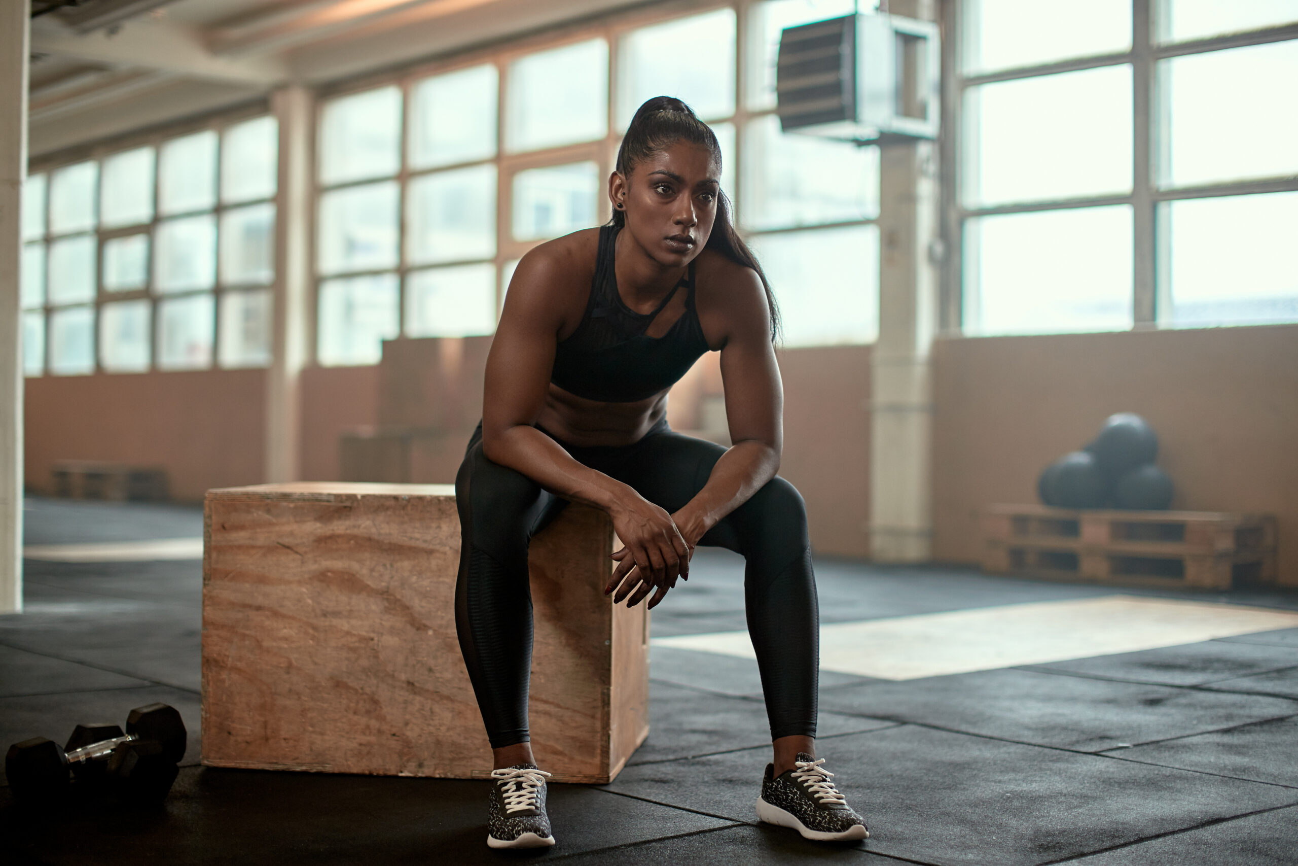
The Novig campaign that sees the American actress pose in sports equipment and very little else, has sparked a wider conversation about women and sport. Is it just a woman owning her body and choosing how she wants to be seen, or does it miss the mark when it comes to celebrating women in sport?
For us, the biggest frustration is the missed opportunity. Especially when you consider that Sweeney has just played Christy Martin, one of the trailblazing figures in women’s boxing. So, seeing her move from portraying an athlete who broke barriers in sport to a campaign where her body is the main focus leaves us asking, Sydney, what are you thinking?
And we’re not the only ones asking the question. Team GB sprinter Amy Hunt addressed Sweeney after her 200m final with a simple interview message: “Sydney Sweeney, this is what women in sport look like: 21.4. Muscles. Hard work, blood, sweat and tears.” Since then, female athletes across social media have joined the conversation, sharing images of themselves training and competing alongside the same message. It’s a powerful reminder that there isn’t one way to be a woman in sport.
And of course, women have every right to own their bodies and choose how they present themselves. That isn’t really the question. The question is what we choose to celebrate. At a time when women’s sport is finally getting the recognition it deserves, we’d love to see more of the spotlight on the women pushing boundaries, breaking records and showing the next generation just how much they are capable of.
CULTURE, CULTURED
If there is something designers like to do, it is find something seemingly insignificant, take it, graft it, zoom in, create a concept, and then create a system based on that singular idea. Love + Money, a Melbourne-based studio, had a dream job to do just that, and they achieved a beautiful outcome.
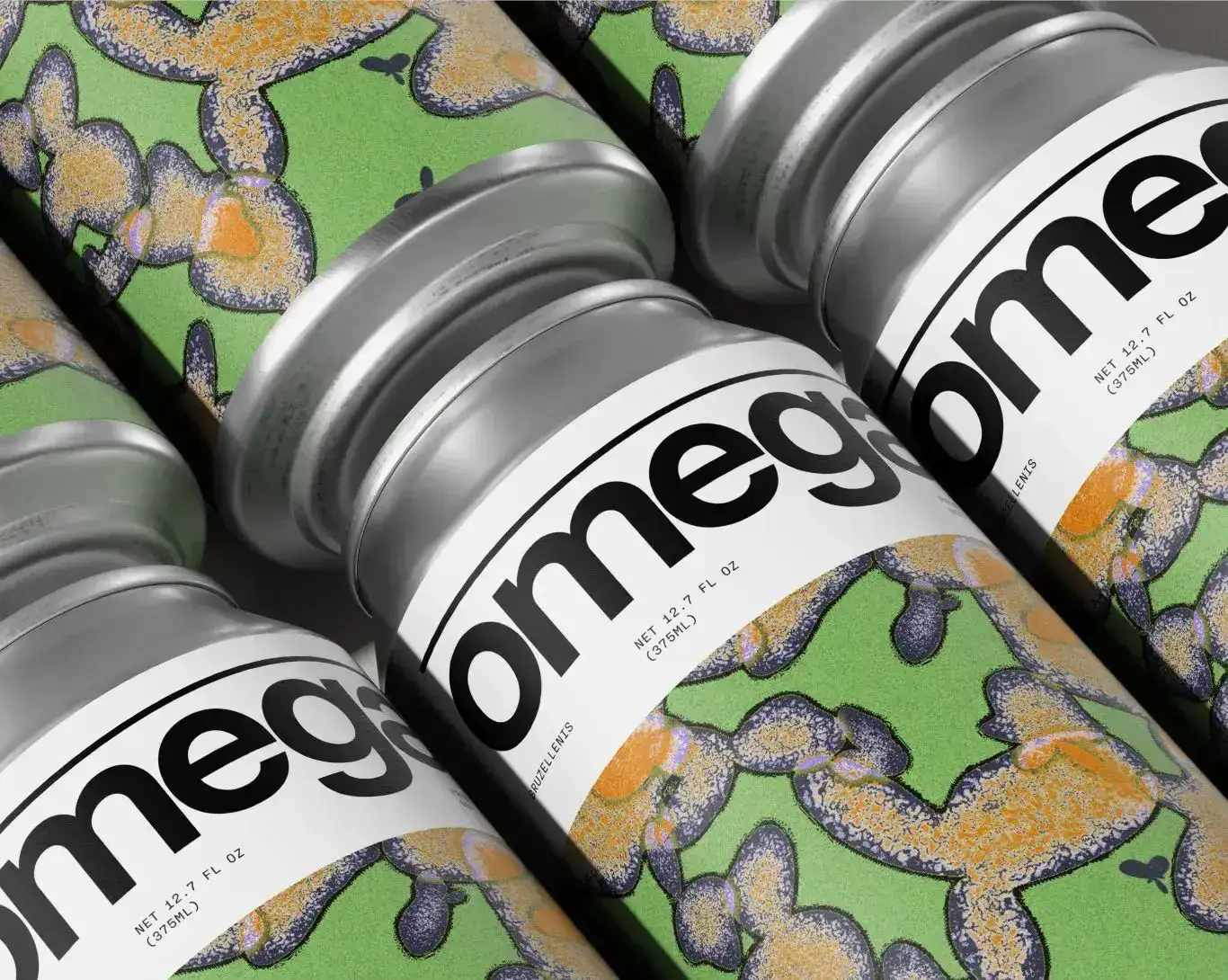
Chicago’s Omega Yeast makes fermentation science for brewers, with a catalogue of roughly 100 strains covering everything from lagers to bacteria, but it was getting flattened into one identity, and the brand had outgrown it. The answer was to let the science do the branding. Every strain is inspired by its own characteristics: attenuation distorts it, alcohol tolerance decides how big it gets.
Most identity systems dodge complexity but, what if the mess the point? Then build a clean, clinical frame around it to hold it all together. A lowercase clinical wordmark, a recurring line motif borrowed from lab equipment, and typography that reads more pharmaceutical than craft beer.
Omega turned the complexity into the logo. A hundred strains, a hundred illustrations, and a beautiful system that is both clinical and chaotic.
Design is in the de-N-A.