In this week’s Our Take – Queensland Health taps Gen Z nostalgia for a clever health campaign, AI scams mug us off yet again, Wonderful Halos defends mandarins with juicy humour, and NYFC scores a rebrand that’s pure Big Apple pride.
A Gen Z Smear Campaign

As Gen Z starts creeping into their late 20s, the unthinkable is happening—they’re starting to feel old. Sorry, Gen X, you’re officially ancient, and Gen Z? Well, welcome to the “cringe” club. Even their go-to phrases are being dragged, and whispers of them becoming the next Millennials are everywhere.
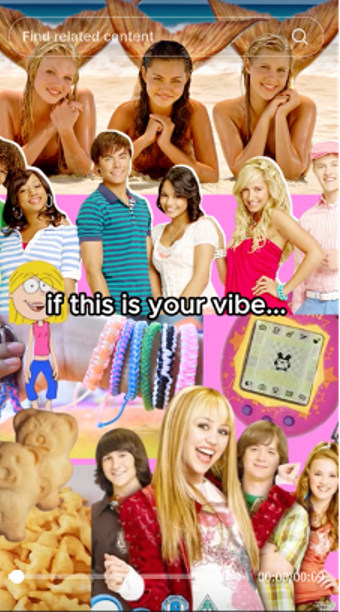
But as they leave their youth-obsessed era behind, one thing is taking centre stage: health. And Queensland Health absolutely nailed it on Tik Tok, tapping into Gen Z nostalgia to encourage 25-year-olds to prioritise their health (yes, we’re talking smear tests). By asking, “Are early 2000s vibes your thing?” and throwing in some cultural throwbacks, they delivered an important message in the playful, no-BS tone Gen Z loves.
It’s a masterclass in speaking their language—because let’s face it, when your audience is feeling the weight of their years (while still bingeing Lizzie McGuire), the key to getting them to care is leaning into the fun and nostalgia they still hold dear. Clever, relatable, and totally scroll-stopping.
Don’t Be A Mug

Once again, shady AI strikes, and this time it’s flogging ‘beautifully crafted crystal mugs.’ Sounds too good to be true? Spoiler: it was. While some savvy shoppers clocked the AI-generated ads from a mile away, plenty of others didn’t—and fell right into the (crystal) trap.
Cue TikTok chaos. Buyers unboxed their long-awaited orders to reveal plastic, flimsy mugs, and, well, absolutely mugging them off. Forget luxury crystal; these were more “failed art class project” vibes.
To make things worse, some sharp-eyed users pointed out that even real crystal shouldn’t be used for hot drinks—it can be toxic and downright dangerous. So, whether these mugs had been crystal-clear or just clearly bad, this scheme was always destined for disaster.
The result? Furious buyers, a sea of broken mugs, and TikTok gold with some laugh-out-loud expectation vs. reality moments.
The moral of the story for 2025: don’t get mugged off. Do your homework, question what you see online, and learn to spot those dodgy AI-generated ads before your cart comes back to haunt you.
Peels of Laughter

We’re suckers for a juicy marketing campaign to kick off the year, and Wonderful Halos -An American Manderin company, has peeled back the curtain on a masterpiece that proves laughter really is the zest medicine.
“Hands Off My Halos” is Wonderful Halos’ first media campaign in five years—and they didn’t just dip their toes in; they cannonballed. The campaign serves up two playful spots that hilariously showcase just how far kids will go to guard their stash of Halos. From IRS reports on their own parents to cutting brake lines (yikes!), these ads take exaggeration to the juiciest extremes.
It’s clear Halos aren’t just a snack but a prize worth defending. With the campaign airing on Amazon Prime, Disney+, Hulu, and Peacock, this gem ensures everyone gets a taste of the action.
This is how you start 2025 with a bang (and a squeeze). “Hands Off My Halos” hits the perfect balance of humour and heart, showing us that when it comes to Halos, sharing isn’t just hard—it’s hilarious. Here’s hoping more brands bring this kind of juicy fun to 2025. Consider the bar officially raised.
From Pitch to Pizzazz

NYFC has absolutely scored with their fresh new look, designed by New York agency Gretel. This rebrand is a total hat trick, celebrating the club’s 10th birthday while gearing up for some serious goals ahead: hosting the FIFA World Cup final in 2026 and opening New York’s first-ever soccer stadium in 2027.
The design is as New York as a slice of pizza and a yellow cab. The typography, inspired by 1940s subway tiles, channels the city’s grit and grind, while the colours are plucked straight from the Big Apple’s vibrant palette. Generative textures bring the buzz of the boroughs to life, and playful pictograms nod to the city’s unmistakable icons. It’s a love letter to New York, written in bold design language.
This rebrand isn’t just about a shiny new badge—it’s about drumming up hometown pride and kicking off a new era for the club. NYFC didn’t just raise the bar; they lobbed it into the top corner. Check out the full identity and see how Gretel has turned New York passion into design gold.
Have a look at the full identity here.