In this week’s Our Take, we look at how Vogue celebrates aging gracefully. Heinz designs a new label to identify its ketchup against competitors’ and we shine a spotlight on a purpose-driven kickstarter campaign for children, by children. And in the world of typography, is Sans Serif dead and what is next? Check it all out below.
BLANDIFICATION
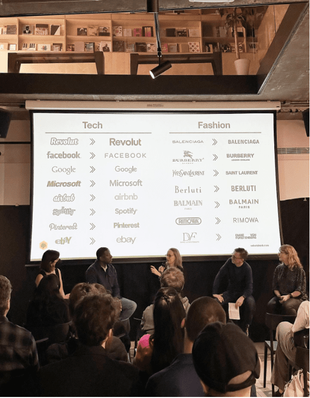
The blanding of branding is no new conversation in design. For years brands have been swimming in a sea of sameness, with generic, sans serif, look alike logos.
Even some renowned design houses have ditched their personality-filled logos to fit the minimalist, clean trends of today.
A typographic conference held by D&AD last month discussed the future beyond san serif fonts with a panel of the world’s leading typography experts discussing this loss of identity.
Thankfully, we’ve already seen some rebellion from bigger brands looking to reclaim their personality. Burberry in particular has been cheered on by the design community for breaking the mold and returning to its ornate, serif-y roots.
And it’s looking like Comic Sans is the weapon of choice for Gen Z in their fight against minimalism, which just shows that we’ll never run out of typographic branding problems to fix.
A SHINING EXAMPLE
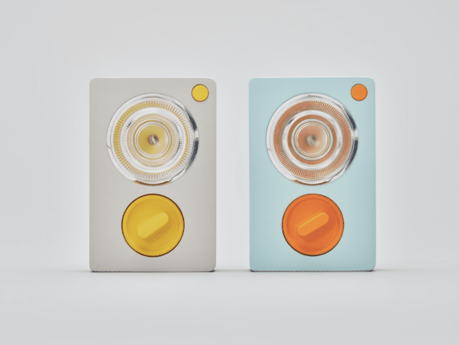
Kids are quite literally the architects of our future. And that’s certainly the philosophy of a new Kickstarter project designed by Pentagram and Ambessa Play, a company dedicated to making STEM learning fun and accessible to everyone no matter what their age or aptitude.
Together, they created a DIY flashlight for children.
But why would kids need a flashlight, apart from an occasional hide and seek adventure or fishing out a lost toy from under their bed?
Well, the creators recognised that in today’s world, the reality is that many children face other challenges, including poverty, war, and seeking asylum – where a flashlight is a precious resource.
Working with children’s charities such as the Refugee Council and Care for Calais, they included displaced children in the design process, incorporating their feedback on early prototypes.
The outcome is a battery-free flashlight that functions as a handheld torch, can be worn around the neck or placed upright on a surface – all things useful for living in a refugee camp.
This is a wonderful example of how a purpose-driven mission, involving the end user can deliver impact and effect real change.
To contribute to the Kickstarter, click here.
IS THAT HEINZ?
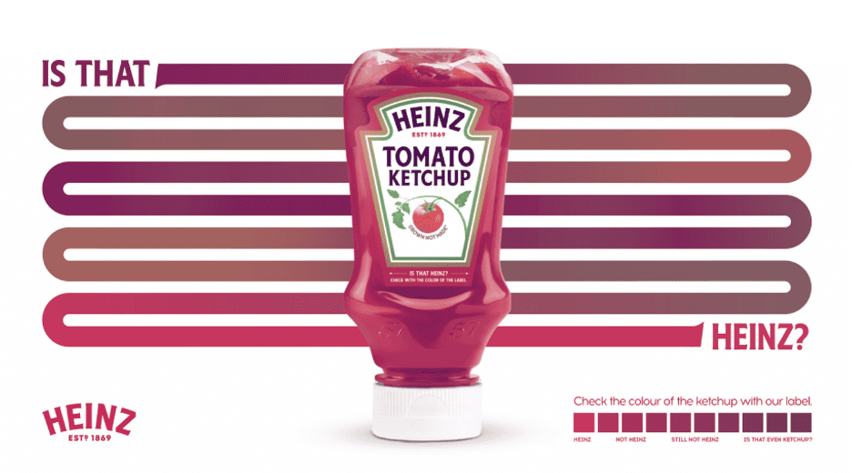
As the old saying goes, the devil works hard but the Heinz marketing team works harder. Over the past few months, the brand has presented the world with some exceptional work.
This week, Heinz Turkey has stepped up with a campaign that sees the creation of a tool called ‘The Label of Truth’ which helps condiment lovers check that they are being served the real deal, rather than an imitation brand. The campaign is a tongue-in-cheek response to some restaurants refilling the Heinz Ketchup bottle with cheaper sauce, trying to pass it as an original.
In the new design, the precise shade of real Heinz ketchup has been printed on the outer border of the front label, so if the colour on the label doesn’t match the sauce in the bottle, it’s an imposter.
In another move to combat so-called ‘ketchup fraud’, they have rolled out an Instagram filter that can be used to check the colour of the ketchup where the new bottle isn’t used.
A simple but genius design upgrade that ticks all the boxes in driving awareness for the brand and acting as a functional guide for ketchup lovers in Turkey.
BEAUTY KNOWS NO AGE
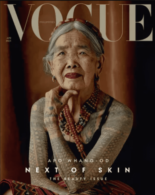
The April issue of Vogue is a celebration of beauty and history, and in keeping with the theme, the fashion magazine has featured 106 year old tattoo artist, Apo Whang-Od.
The Filipino tattoo artist, who is the oldest practitioner of the traditional Kalinga tattoo, will make history as the oldest star to appear on the cover of the legendary magazine. With the cover photo captured by Artu Nepomucemo, Vogue is celebrating the piece as “a breath of fresh air in beauty standards, contradicting the known social rules of “young = beautiful”.
The relevancy of this cover in 2023 is important, the theme of the issue is no doubt a response to a new wave of beauty standards which sees modern AI filters augmenting our own identity on social media, projecting an unachievable beauty standard and raising questions amongst many about how they look.
The Vogue issue is a welcome celebration of the natural process of aging that we all go through.